Every AI coding session — 30-day pilot data
Three weeks after rolling out Claude Code to our engineering team, I opened our newly-built dashboard and saw something I didn't expect.
One developer had run 67 AI sessions that month. Another had run 2. Same tool, same onboarding, same week-one kickoff call. The 67-session developer averaged 10 prompts per session — deep, multi-step coding conversations. The 2-session developer opened the tool, typed one prompt, and never came back.
We didn't find this in a survey. We didn't find it by asking "hey, is everyone using the AI tool?" We found it because we built an activity tracking layer (in week 2 of the rollout) and pointed it at ourselves.
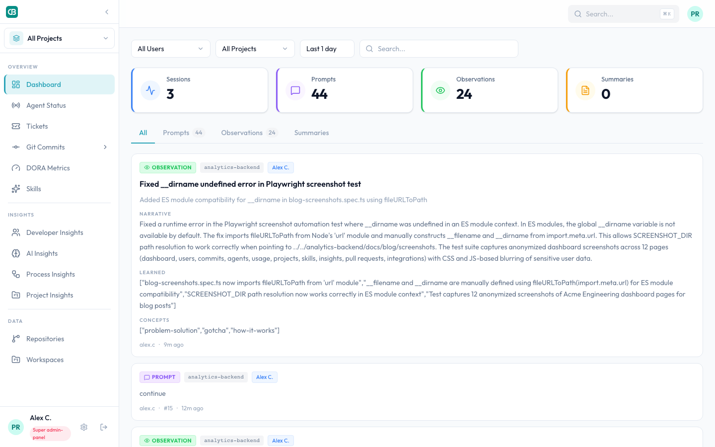
This post is about what that data showed us — the surprises, the patterns, and the things every comparison blog gets wrong about choosing an AI coding tool for your team.
The comparison you've already read
Claude Code, Cursor, GitHub Copilot — you've seen the feature tables. We're not going to repeat them.
After deploying AI coding tools to 29 paid seats across our 22-developer engineering team and 12 active projects, we learned that the tool you pick matters far less than whether you can see it working.
The 5 things that surprised us
1. Adoption wasn't binary — it was a spectrum
We expected two groups: "uses it" and "doesn't use it." Instead, we found a gradient.
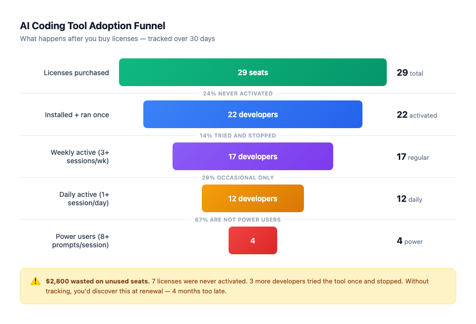
| Group | Seats | Sessions/month | Prompts/session | Behavior |
|---|---|---|---|---|
| Power users | 4 | 35–67 | 8–10 | Daily driver, deep conversations |
| Regular users | 8 | 15–30 | 5–7 | Used it most days, lighter sessions |
| Occasional users | 5 | 8–15 | 3–5 | Used it a few times a week |
| Tried-and-stopped | 5 | 1–3 total | 1–2 | Opened it, didn't stick |
| Never activated | 7 | 0 | 0 | Registered, never ran a session |
| Total | 29 |
$2,800 of wasted seats. Twelve paid seats generating zero — or near-zero — value. Without tracking, we'd have discovered this at renewal time, four months too late.
The gap between power users and occasional users wasn't about skill level. Our most senior backend engineer was in the "occasional" group. Our mid-level full-stack developer was the #2 power user. The difference was workflow fit — some projects and some coding styles benefit more from AI assistance than others.
2. 47% of all AI activity concentrated in a single project
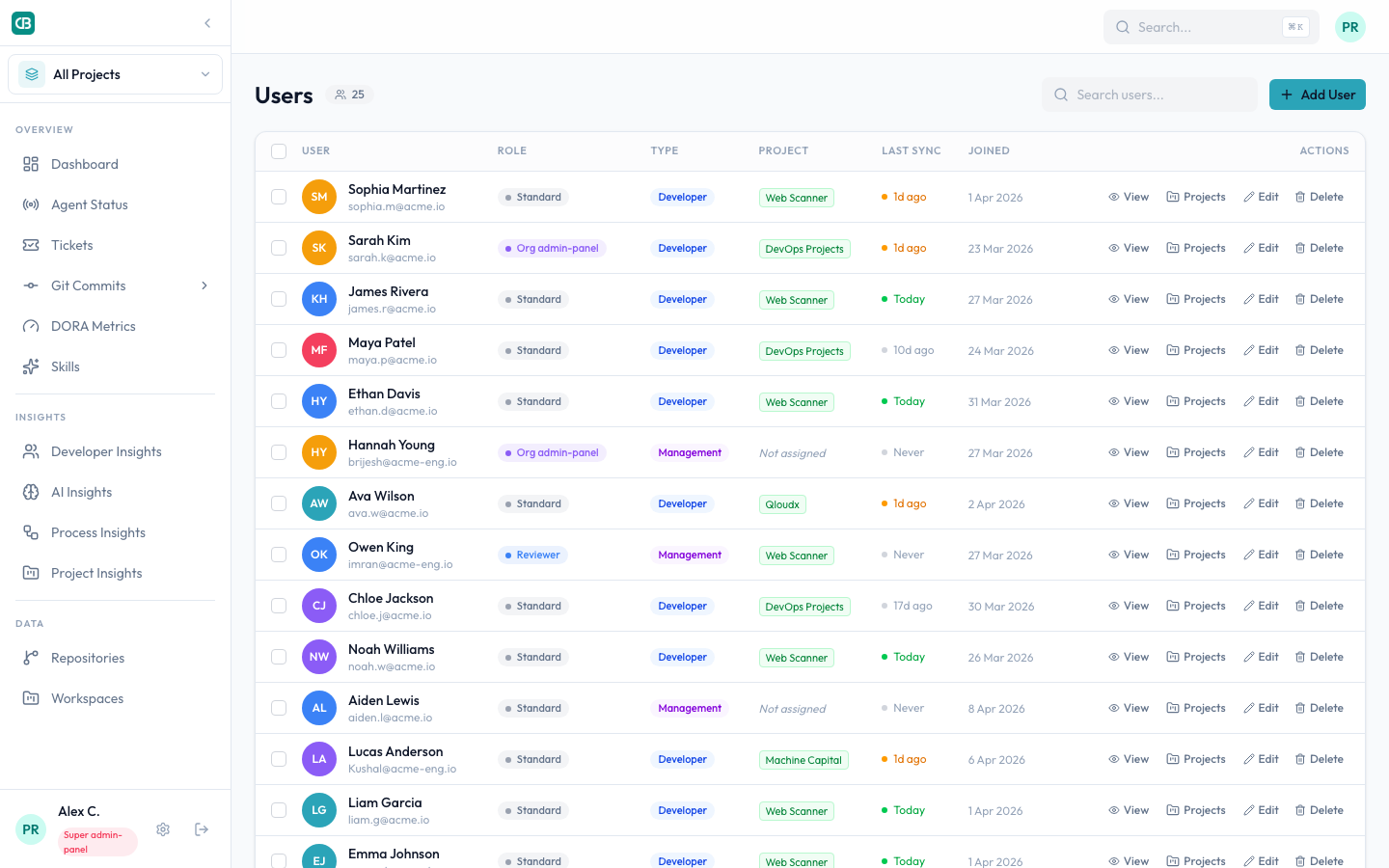
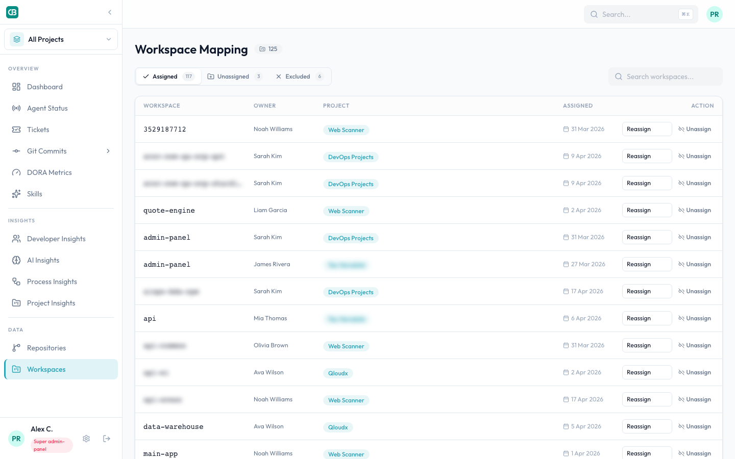
We tracked sessions across 12 active projects. One project — a large enterprise platform with a complex backend — accounted for 312 of 668 total sessions. Nearly half.
The top 3 projects combined represented 70% of all AI-assisted work. The remaining 9 projects shared 30%.
The high-AI projects had clear patterns: large codebases with CRUD APIs, well-documented code that AI could learn from, repetitive boilerplate. The low-AI projects were infrastructure (Terraform, Kubernetes), legacy systems with minimal documentation, and highly specialized domain code where AI suggestions were more often wrong than right.
The implication for tool selection: If you evaluate an AI tool by running a pilot on your infrastructure team, you'll conclude it doesn't work. If you run it on your API team, you'll think it's transformational. Neither conclusion is right — the tool's value varies by project type, and you need to measure across all of them.
3. The "setup tax" was real and invisible
We deployed to all 22 active developers. Within the first week, 3 had broken sync configurations that silently failed. Their local tool worked fine — they could code with AI assistance — but their activity data wasn't reaching our dashboard.
One developer on Windows had a corrupted environment file. Another had a VPN configuration that blocked the sync agent's outbound requests. A third had an outdated plugin version that skipped every other session.
None of them reported the issue. From their perspective, the tool was working. From the manager's perspective, those 3 developers appeared to have zero activity — indistinguishable from "chose not to use it."
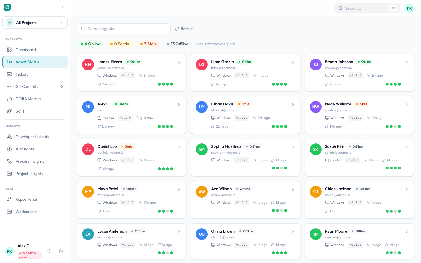
We only caught it because our health monitoring dashboard showed their sync agents as "offline" with red indicators. Without that signal, we'd have misread our adoption data for weeks.
The broader point: Every AI coding tool works great on the developer's machine. The question is whether you know it's working on everyone's machine. Multiplied across all paid seats, these invisible setup failures represent real money and real lost productivity data.
4. Commit patterns changed — but not how we expected
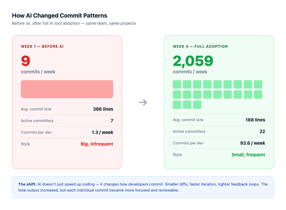
We tracked git commits across all repositories, not just AI-assisted sessions. This gave us a before-and-after view of the team's output.
| Week | Commits | Active committers | Avg. commit size |
|---|---|---|---|
| Week 1 (baseline) | 9 | 7 | 386 lines |
| Week 2 (rollout starts) | 79 | 13 | 588 lines |
| Week 3 (adoption ramping) | 1,334 | 21 | 644 lines |
| Week 4 (full adoption) | 2,059 | 22 | 188 lines |
Week 4 is the interesting row. Commits went up dramatically, but average commit size dropped by 70% from the peak. Developers weren't writing more code per commit — they were committing more frequently with smaller, more focused changes.
This is a behavioral shift that AI encourages: when generating code is faster, the natural response is to work in tighter iterations. Smaller PRs, faster reviews, quicker feedback loops.
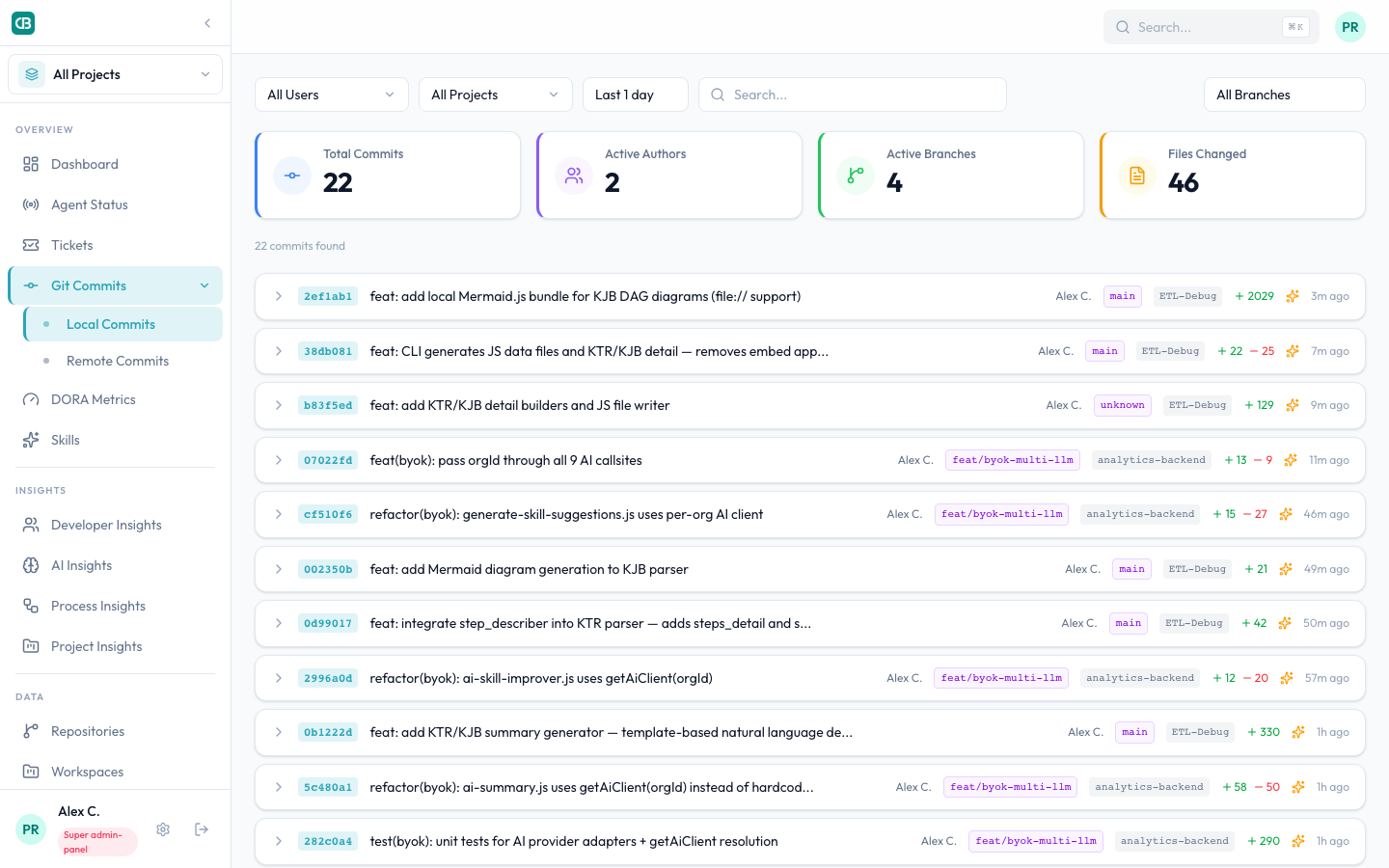
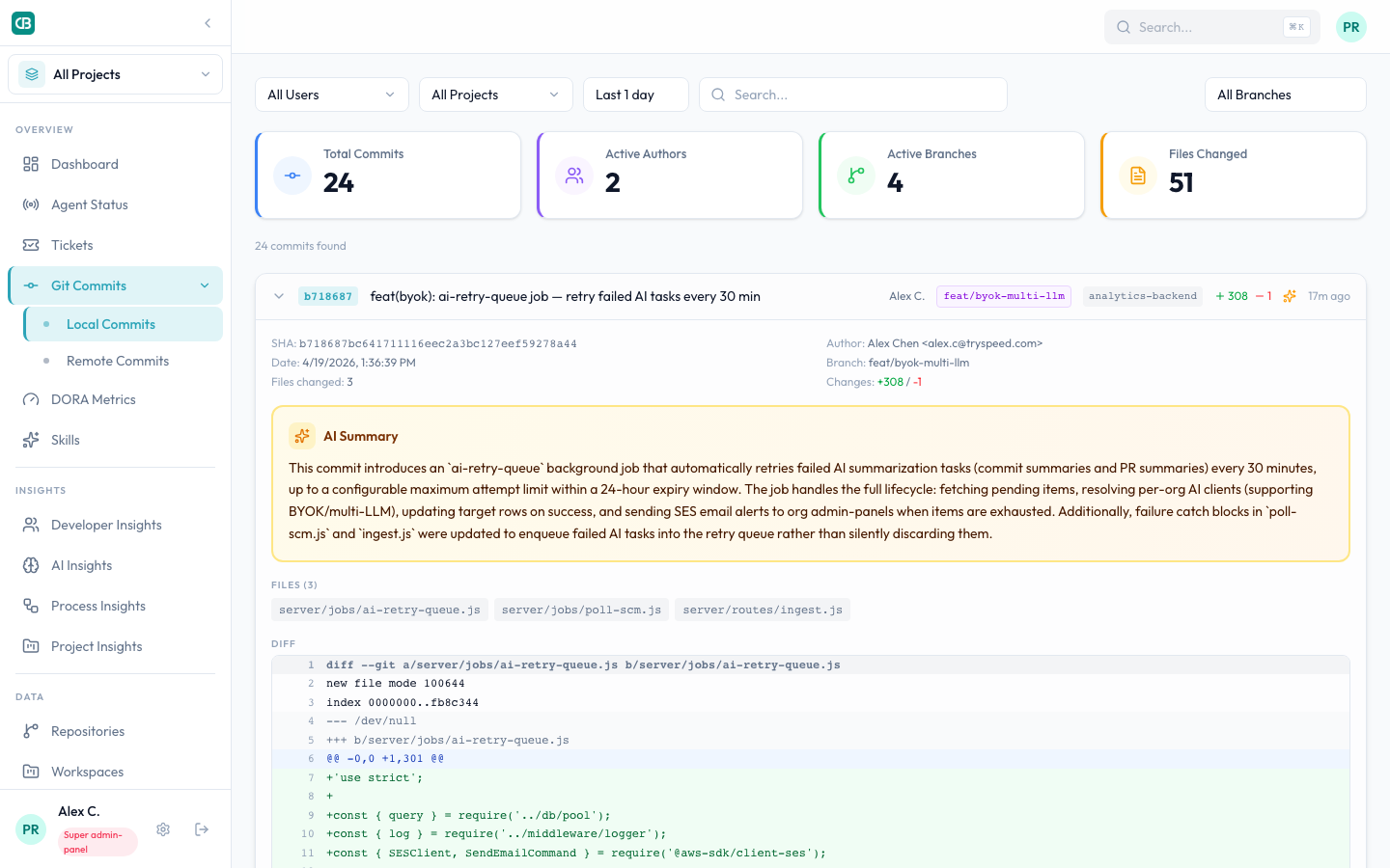
We also ran AI-powered summaries on every commit. An unexpected side effect: the AI-generated commit summaries were consistently more descriptive than the hand-written ones. Developers started writing better commit messages — not because we asked them to, but because seeing the AI's summary next to their own created subtle peer pressure.
5. The "10x developer" promise is wrong. The real number is specific to your team.
The marketing pitch is "10x productivity." Our data says the multiplier is real but wildly variable:
- Backend API development: 2.5–3x faster based on commit velocity and session depth
- Frontend React work: 1.5–2x — AI is helpful but needs more correction in UI code
- Infrastructure/DevOps: 1.0–1.2x — barely faster, sometimes slower (AI-generated Terraform needs careful review)
- Legacy code maintenance: 0.8x — yes, slower. AI confidently suggests changes that break undocumented edge cases
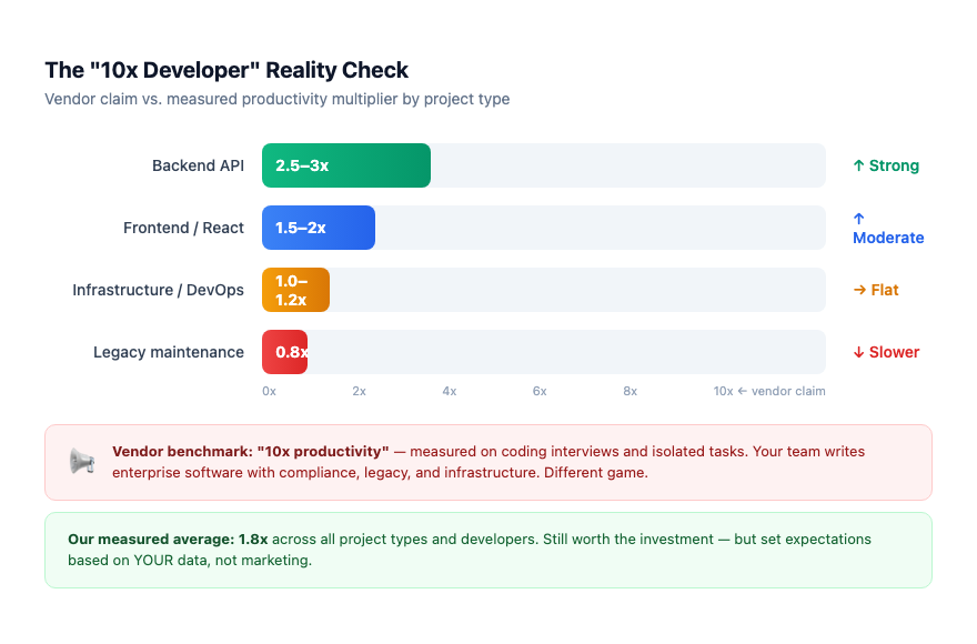
The average across our team and project mix: roughly 1.8x. Meaningful, absolutely worth the tool cost, but nowhere near the headline number. And that average hides the range — your number depends entirely on what your team builds and how they build it.
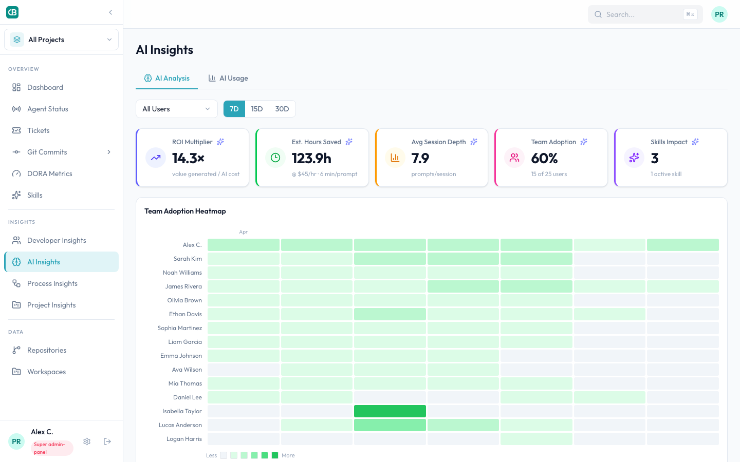
You can't know your number without measuring it. The vendor benchmark was done on coding interview problems. Your team writes enterprise software. Those are different activities.
What we'd do differently
Measure from day one. We bolted on the dashboard layer in week 2. That means our week-1 "baseline" data is sparse — we have local session data from the tool itself, but no team-level visibility for the first seven days. If you're rolling out AI tools, instrument the measurement layer before you hand out licenses.
Set adoption targets per team, not per org. "80% adoption in 30 days" is meaningless when your backend team hits 95% and your DevOps team hits 20%. Set realistic targets by project type and measure against those.
Share the dashboard with the whole team. We initially kept the activity data admin-only. When we opened it up, two things happened: low-usage developers voluntarily increased their usage (visibility creates accountability), and power users started sharing tips in Slack (visibility creates community).
Don't evaluate the tool by the tool's metrics. Every AI coding tool will tell you how many completions it served. That's like a gym telling you how many times the door opened. The question is whether the workout is working — and for that, you need to measure outcomes (commits, PRs, deploy frequency), not inputs (completions, sessions).
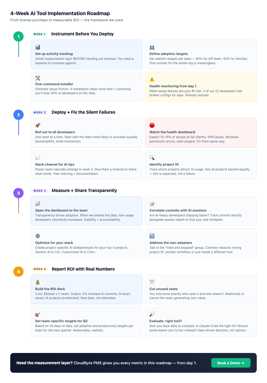
The 4-week implementation framework
Based on everything we learned, here's the phased approach we'd recommend for any engineering team deploying AI coding tools:
The management layer is the missing piece
Here's the core insight after 30 days of data:
Claude Code, Cursor, and Copilot are all optimizing for the same thing — the individual developer's experience. Better autocomplete, smarter suggestions, faster code generation. And they're all good at it.
But none of them are optimizing for the engineering manager's experience. None of them answer:
- Which developers are actually using the tool?
- Which projects benefit most?
- Is the $50/seat/month investment producing measurable output?
- Are all setups healthy, or are some silently failing?
- What does our adoption curve look like week over week?
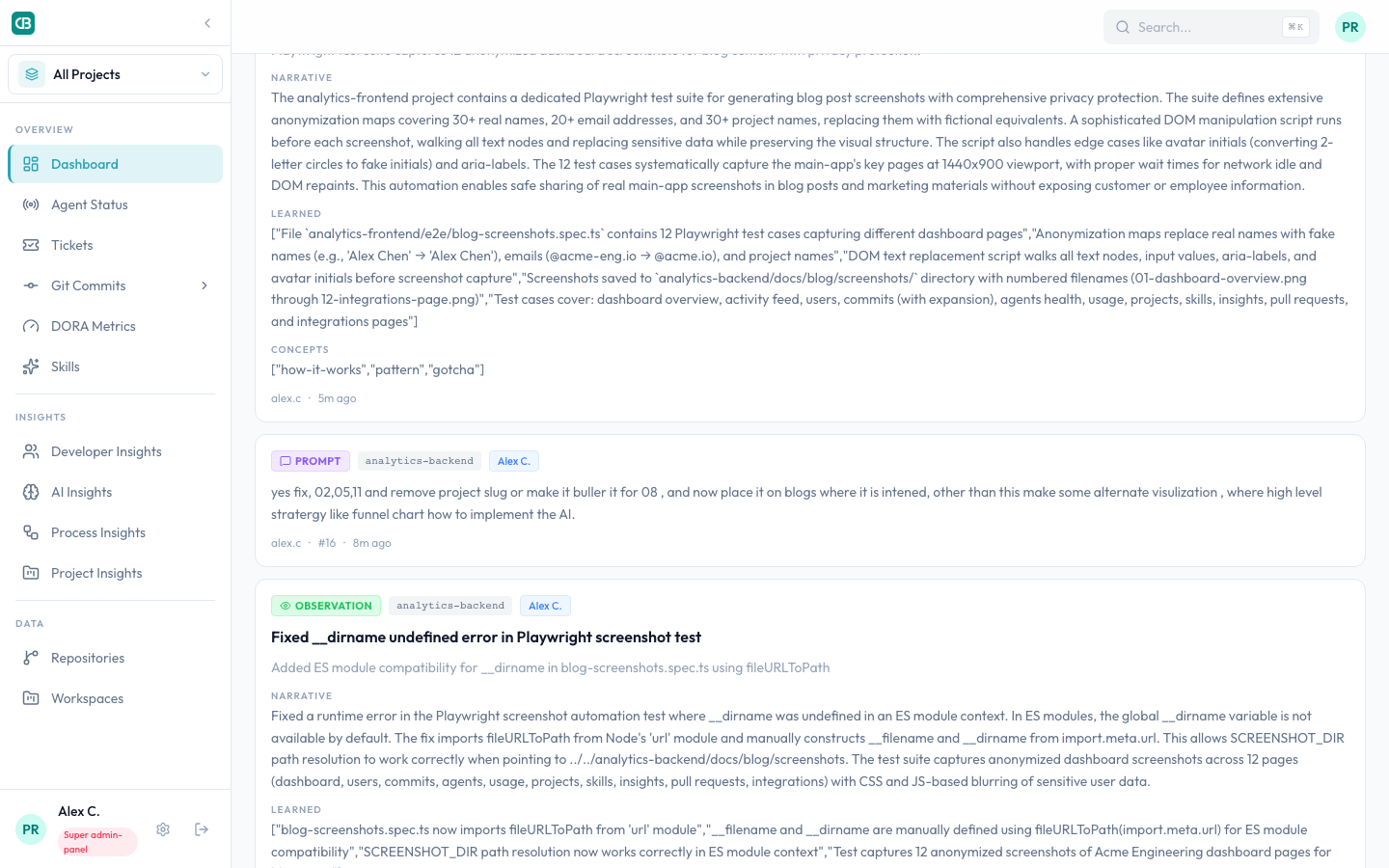
This is the gap we discovered by building our own measurement layer. The tool you choose for your developers matters. But the visibility you have into how that tool is being used — that's what determines whether you can justify the spend, optimize the rollout, and actually realize the productivity gains.
We built CloudByte PMS because we needed these answers for our own team. Then we realized every engineering team deploying AI tools needs them too.
Your team is generating data right now. Can you see it?
If you're managing an engineering team using AI coding tools and your only metric is "we bought licenses," you're flying blind.